


Overview
Goal: Enhance user experience, improve website navigation, and reflects Fenty Beauty’s inclusive and innovative brand identity.
Outcome: A modern, visually appealing website and application design that addresses usability challenges
and aligns with the brand’s goals.
Services
UX Design, UI Design, Information design
Started date
November 2024
Tools used

Introduction
Fenty Beauty is a renowned beauty brand celebrated for its inclusivity and innovative products. While the brand thrives in offering diverse products, its website faced usability challenges that hindered user engagement.
I decided to redesign the Fenty Beauty website to enhance its user experience, improve navigation, and ensure the design aligns with the brand's vision. My objective was to create an intuitive and visually captivating interface catering to Fenty’s diverse audience.
Problem Statement
I wanted to create a new design for the Fenty Beauty website that is more user-friendly and easy to navigate. The previous design had excessive hover effects and too much going on, which felt distracting and irritating for users. My goal was to simplify the interface and improve the overall user experience..
These issues motivated me to develop a more user-centered and aesthetically pleasing redesign.
Research & Insights
To ensure the redesign addressed user needs, I conducted thorough research:
-Competitive Analysis: Examined websites of leading beauty brands to identify successful design trends.
-User Feedback: Analyzed user reviews and pain points related to the existing website.
Key Findings:
o Users preferred clean layouts with clear navigation.
o Visually rich content improves engagement.
User Testing
The prototype underwent usability testing:
- Process: Gathered feedback from a small group of users.
- Results:
o 80% of participants found the navigation significantly easier to use.
o Suggested improvements, such as refining the search bar, were incorporated.
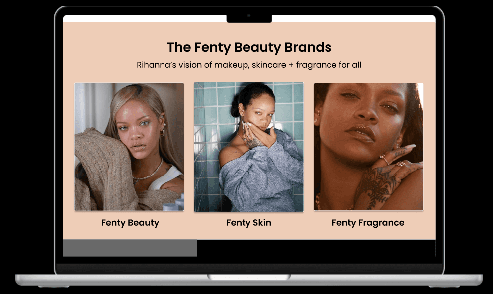
Key Features
The redesign introduced several improvements:
- Simplified Navigation: A clean, intuitive menu for easier product discovery.
- Enhanced Product Pages: Larger visuals, detailed descriptions, and a focus on accessibility.
- Personalized Experience: Added sections for recommendations based on user preferences.
- Responsive Design.
Design Process
1. Brainstorming & Ideation: Created sketches and wireframes to explore layout options.
2. Mood Board Creation: Developed a visual guide for colors, typography, and imagery that aligns with Fenty Beauty’s branding.
3. Prototyping in Figma: Built high-fidelity mockups emphasizing:
o Streamlined navigation.
o Bold product visuals.
o A mobile-first approach.


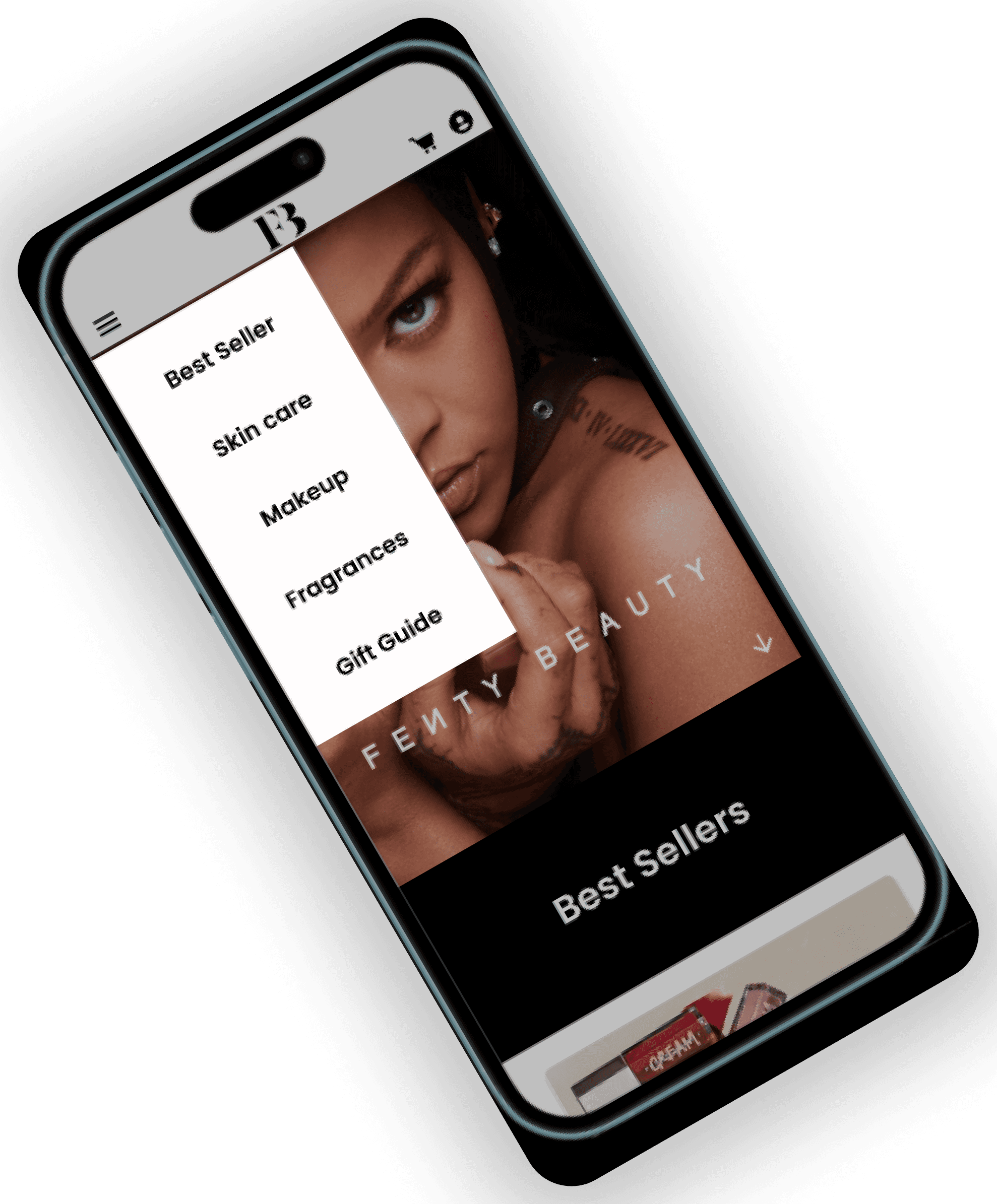
Mobile Version
Conclusion
The Fenty Beauty website redesign enhances the user experience by simplifying navigation, improving responsiveness, and creating a visually compelling design. It reflects the brand’s commitment to inclusivity and innovation, ensuring a seamless digital experience for its audience.
up
Reflection & Lessons Learned
This project was a valuable learning experience:
- Challenges: Balancing visual appeal with functionality was initially difficult but taught me the importance of iterative design.
- Takeaways: User testing and feedback are critical in creating a design that meets user expectations.